
What is a spectrogram and how to read it: a guide
What a spectrogram is, how to read its time axis, frequency axis and color scale, and why it shows things a plain waveform simply cannot.
What is a spectrogram?
A spectrogram is a way of plotting sound across three pieces of information at once: time, frequency, and energy. The horizontal axis is time, the vertical axis is frequency in Hz, and the color or brightness at each point shows how much energy sits at that exact frequency at that exact moment.
Unlike a waveform, which only plots amplitude (loudness) over time with zero frequency information, a spectrogram reveals the frequency structure of a sound: which parts have bass, which have high-frequency detail, which have hiss or noise, and which frequency range has nothing in it at all.
How is a spectrogram different from a waveform?
A waveform is what you see in most music players and editors: a line rising and falling over time, showing which parts are loud or quiet. It's useful for cutting, aligning and trimming, but it says nothing about the frequency content of the sound.
A spectrogram answers exactly the question a waveform cannot: which frequencies are present, how strong they are, and how that changes over time. Two files can have nearly identical waveforms (the same loudness pattern) and still have completely different spectrograms, for example one bright and full of high-frequency detail, the other dark and cut off at the top.
How does software actually draw a spectrogram?
A spectrogram is built using a transform called an FFT (Fast Fourier Transform). You don't need the math, just the idea: an FFT slices an audio file into thousands of tiny segments, called an FFT window, and for each segment it works out which frequencies are present and how strong they are. Stitch thousands of these snapshots together along the time axis, and you get a full spectrogram.
A shorter window gives more precise timing (you know exactly when a sound happened) but less precise frequency detail (it's harder to tell two close frequencies apart). A longer window is the opposite: sharper on frequency, blurrier on timing. This is an inherent trade-off in how FFTs work, not a flaw in any particular viewer, and it's why different spectrogram tools can render the same file slightly differently.
How does the frequency axis relate to sample rate and the Nyquist frequency?
A digital audio file captures sound by sampling it tens of thousands of times per second. The most common sample rates are 44.1kHz (CD standard) or 48kHz. Per the sampling theorem, the highest frequency a file can accurately capture is exactly half the sample rate, called the Nyquist frequency: a 44.1kHz file has a Nyquist ceiling of 22.05kHz, a 48kHz file has a ceiling of 24kHz.
That means the vertical axis of a spectrogram can never show content above the file's Nyquist frequency, even though human hearing typically tops out around 20kHz (and drops further with age). Knowing this theoretical ceiling helps you read a spectrogram more accurately: if a 44.1kHz file's content stops at 16kHz instead of extending close to 22.05kHz, that isn't a limitation of the file format, it's a sign some other processing step cut the higher frequencies.
How to read the colors: common patterns to look for
- Bright or intense color: strong energy at that frequency and moment.
- Dark or near-transparent areas: close to silent at that frequency.
- A bright horizontal line at one fixed frequency: usually hum or electrical noise.
- A bright block spreading across the whole frequency range for a brief instant: usually clipping or a sudden loud transient.
- A flat horizontal boundary near the top, a clean line separating signal from an empty band above it: a high-frequency cutoff, see spotting fake lossless music with a spectrogram for a deeper look.
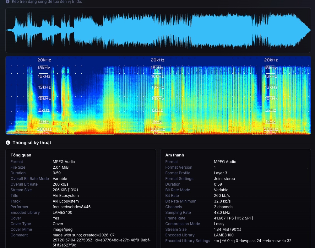
The best way to actually understand a spectrogram is to look at a real one. Try Tách Nhạc's spectrogram viewer: drag and drop any audio file, nothing gets uploaded, everything renders right in your browser.
Primary sources
What is a spectrogram used for?
A spectrogram shows the frequency content of sound over time, something a waveform cannot show. It's used to check whether a file has been hi-cut, spot clipping, judge the noise floor, find resonant frequencies while mixing, or check a separation result for leftover vocal bleed.
How high can the frequency axis of a spectrogram go?
Never higher than the file's Nyquist frequency, which is half the sample rate. A 44.1kHz file has a theoretical ceiling of 22.05kHz, a 48kHz file has a ceiling of 24kHz.